BRIEF
Problem
Storypanda needed a plan for dealing with the iOS6 design cut-off date.
Metric
Improve usability – measured by user surveys and click–throughs.
DESIGN
Research
After a lot of research and a re–evaluation of the target market and design principles, the challenge was identified.
Challenges
Based on the design principles of deference, clarity and depth, how can we make the app more iOS 7 friendly and usable?
DEFINITION FOR APPLE ‘S iOS 7 TERMS
Deference
The UI helps users understand and interact with the content, but never competes with it.
Clarity
Text is legible at every size, icons are precise and lucid, adornments are subtle and appropriate. Also, a sharpened focus on functionality motivates the design.
Depth
Visual layers and realistic motion impart vitality and heighten users’ delight and understanding.
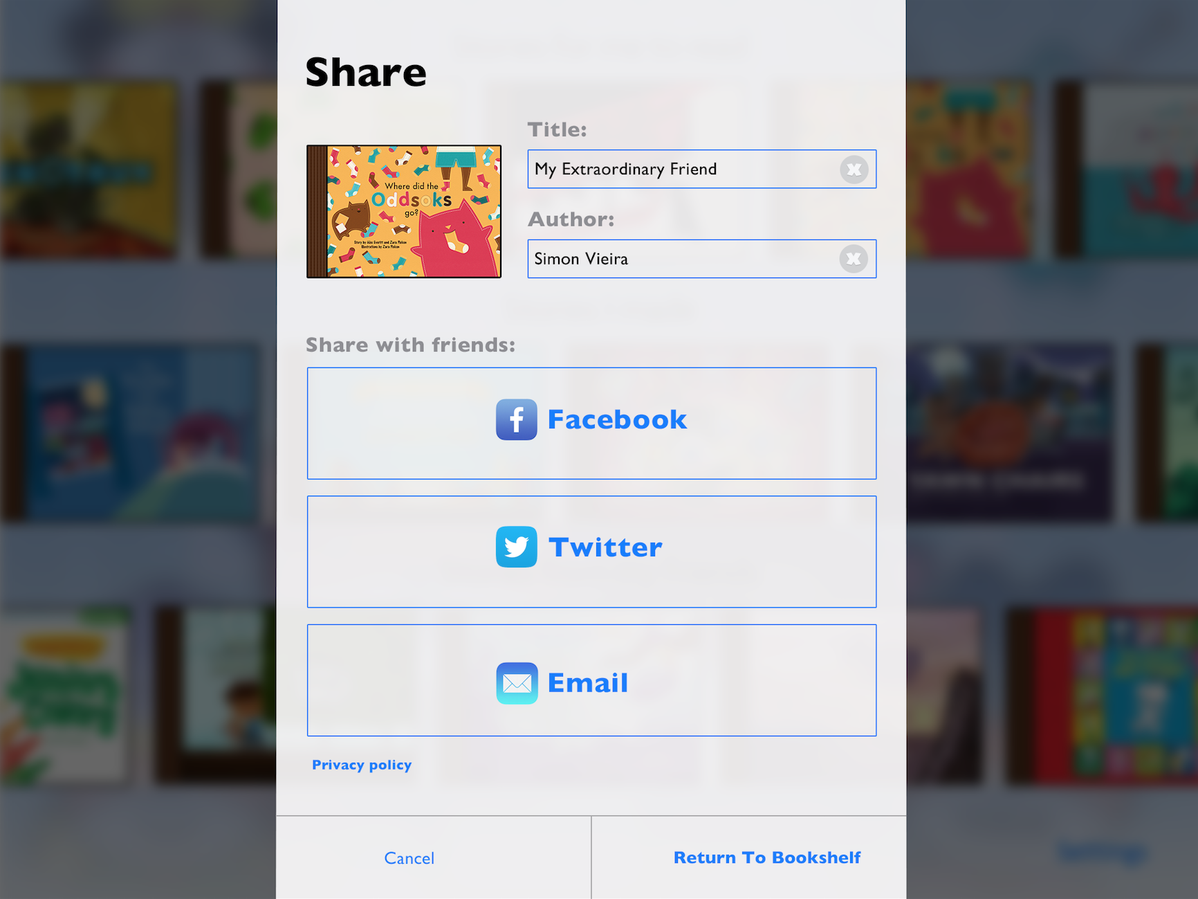
SOLUTION
For Deference
Remove skeuomorphic bookshelf and make the content, the books, bigger so they are the main attraction.
Utilize the whole iPad screen, giving room for more books to be displayed.
For Clarity
Have the books to read be in the top left corner to Improve the hierarchy of information.
Have all the pop ups and UI be flat and breath through the whole screen.
For Depth
Have the main interactions be enhanced with motion.
What are the main interactions?
When users interact with a book, to buy or to read – E.g. book animates to the front and opens.


Before
Designed for iOS 6. Art and design direction by me as well.


Below are some examples of the interactive books we created. I art and design directed all Storypanda's books and apps.
